Recovering trust and reducing technical debt by making pricing logic server‑true and payment plans instantly readable.
Role & Team
Lead Product DesignerCheckout Team, PM, Engineering, Data
Scope
Full Checkout RefactorPricing selector + summary + API logic
Experiment
~570k Sessions50/50 A/B, 3–4 weeks
Problem
ablefy powers creators selling products with complex pricing options (subscriptions, installments, bundles) and advanced settings like custom intervals and absolute dates. Checkout is the single point where trust is either earned or lost.
For years, the experience was held together by frontend logic that was risky to touch, and sellers reported the inconsistencies repeatedly. We decided to fix the root cause instead of applying another visual band‑aid.
The “Hidden” Price
Pricing was calculated in the browser, leading to rounding errors and mismatches between checkout and invoice totals.
The “Wall of Text”
Complex plans were described as dense paragraphs, forcing users to mentally calculate dates and totals.
Both issues damaged trust and created legal risk under EU/German transparency requirements.
Discovery
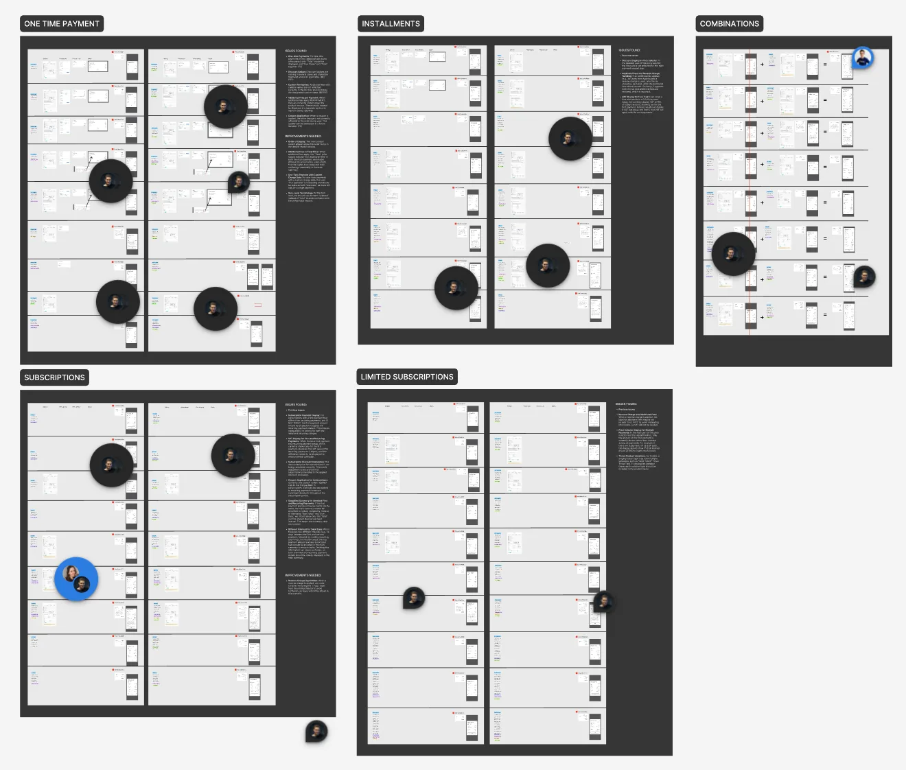
There was no single source of documentation, so I mapped every pricing path myself to avoid blind spots.
Main product + order bump with different plan types (e.g., subscription + installments) and how they render together in the summary.
I documented plan combinations and edge cases to build the requirements matrix.
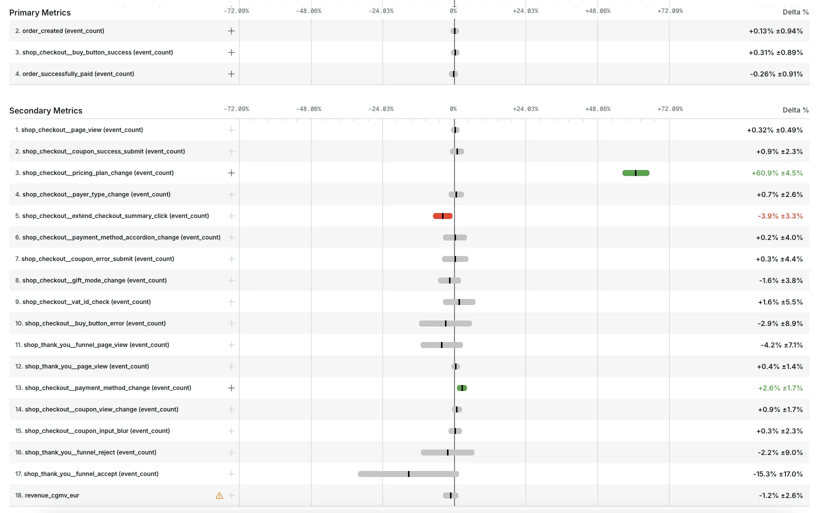
Validation
We ran moderated usability sessions and counter‑balanced the order to reduce bias. The patterns were consistent across participants.
Trust erosion
Unexpected totals felt misleading and made people doubt the price summary.
Cognitive overload
Dense descriptions forced mental math to decode payment schedules.
Decision paralysis
Unclear totals made it harder to commit, especially on installment plans.
Remote usability sessions comparing the legacy text block and the new timeline.
Hypotheses
Hypothesis 1: Clear totals reduce confusion
By always showing the total price in the summary, we reduce payer confusion and prevent drop‑offs during checkout.
Hypothesis 2: Breakdown builds trust
Providing a detailed price breakdown (items, taxes, shipping) increases trust and should lift conversion.
Solution
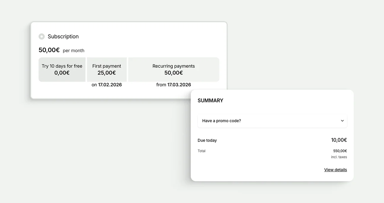
Visual Payment Timeline
Replaced legal text with clear milestones: free trials, first payment, recurring dates, total amount.
Backend‑Driven Summary
Moved pricing logic to the backend so checkout and invoice totals always match.
Progressive Disclosure
Edge cases with many rates show a clean summary with a “View Details” breakdown.
Customization & Mobile
Timeline color adapts to seller branding; layout stacks cleanly on mobile.
Before & After
A quick visual snapshot of how we made pricing clarity obvious without overwhelming users.
Pricing plan selector
Before: Key totals were buried in text, and the headline price often showed only the first payment.After: The timeline calls out due dates and total amount (plus how many rates).
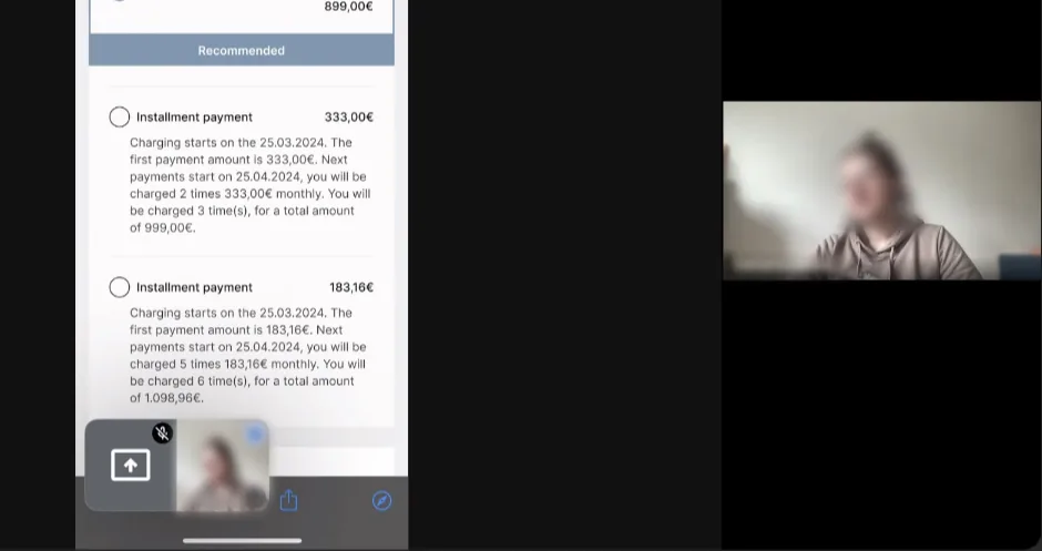
Before
Payment options
550,00€
The test period is 10 days. The first "payment" is free, and you will be charged at the end of the test period.
10,00€
Charging starts on the 07.02.2026. The first payment amount is 10,00€. You will be charged 10 time(s), for a total amount of 550,00€.
25,00€
The test period is 10 days. The first "payment" is free, and you will be charged at the end of the test period. Charging starts on the 17.02.2026. The first payment amount is 25,00€.Next payments start on 17.03.2026 50,00€ monthly.
Text-only plan description with hidden totals and unclear rate schedule.