How a data-driven redesign of payment method selection increased net take rate to 3.10% and generated +€47k EBITDA.
Checkout is where sales are won or lost. When looking to boost conversion—which is essential to both our sellers' success and ablefy's growth—one issue stood out: payment methods were shown in random order.
This lack of logic meant buyers weren't guided toward better options, leading to more failed payments and higher costs. We saw an opportunity to fix that.
Displaying too many payment methods increases cognitive load, making it harder for users to decide.
High-adoption, low-failure methods (like Apple Pay, Klarna, SEPA) weren't featured prominently.
Fragmentation led to suboptimal method use—impacting both seller payout and platform profitability.
Partnered with the data team to build a payment methods matrix measuring:
How often each method is selected by buyers.
Percentage of completed payments without failures.
Net profitability per payment method.
Using this data, we identified an optimized order that could maximize both adoption and platform profit: PayPal, Klarna, SEPA, Apple Pay, Bank Wire, Google Pay, Card, Ideal, P24, Pay Later.
We identified payment methods with beneficial attributes for payer adoption, failed transfer rates, and price. We wanted to increase the share of these methods to boost revenue for sellers—and ultimately ablefy.
Since we can't remove any seller-selected payment methods, we focused on visually guiding users to the top options. A large-scale experiment would show us which design actually drove the best results.
Implementing a horizontal payment selector—showing only four options without scrolling—and reordering payment methods will steer users toward more profitable choices, increasing net take rate.
A horizontal payment selector showing only four options will make it easier for users to choose, leading to more buy button clicks and successful payments.
The control was a traditional vertical list showing all payment methods stacked. This created cognitive overload—users had to scan through 7+ options with no visual hierarchy guiding them toward optimal choices.


All 10 payment methods visible at once. No visual hierarchy. Random order based on legacy logic.
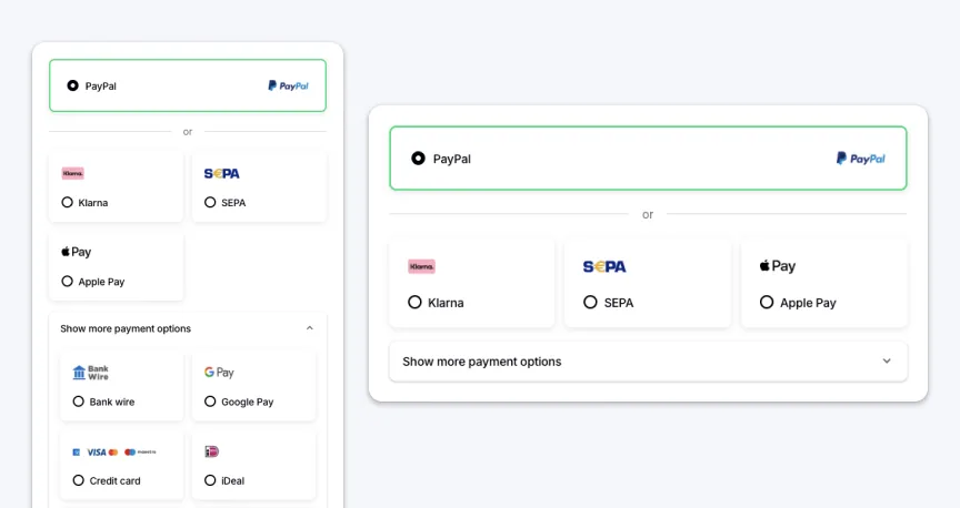
We tested two new horizontal layouts. The key difference was on desktop only—Variant B hides additional payment methods behind an accordion, while Variant C shows all methods at once. Mobile experience was identical across both variants.
Only 4 methods visible. Click accordion to reveal 6 more: Bank Wire, Google Pay, Credit Card, iDeal, Przelewy24, Pay Later.
All 9 payment methods visible at once. More cognitive load, +14.3% buy button errors.
Duration of the A/B/C test to achieve statistical significance.
Total sessions included in the experiment.
Gradual increase from 10% to full traffic.
Tool used: Statsig
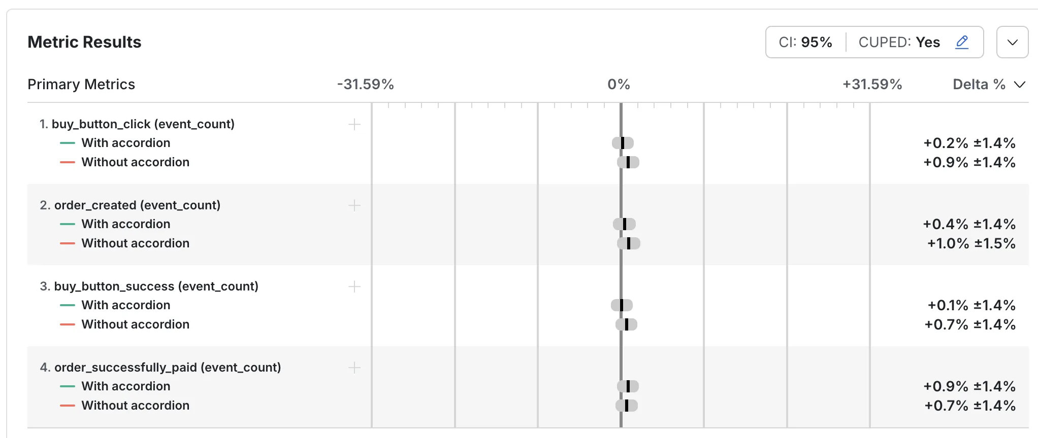
Variant B performs best with statistical significance (p-value: 0.00001)
Variant B achieved the highest net take rate, outperforming both control and Variant C.
Variant B generated €774,772 in EBITDA—€47k more than the control group.
Slight decrease in buy button clicks and order creation, but not statistically significant.
| Variant | Net Take Rate | EBITDA | Δ vs. Control |
|---|---|---|---|
| Control | ~2.91% | €727,684 | – |
| B | ~3.10% | €774,772 | +6.47% |
| C | ~3.06% | €753,900 | +4.51% |
Statistical analysis from Statsig confirming significance (p-value: 0.00001)
We intentionally introduced friction for a lower‑margin method, reducing Pay Later clicks by 30% while protecting Net Take Rate.
Apple Pay saw a significant increase in both clicks and completed orders, whether or not the accordion was used.
Klarna had a moderate increase in clicks when all options were visible (no accordion).
Prioritizing high-margin methods increased Net Take Rate to ~3.10% and generated +€47k EBITDA.
We reduced Pay Later usage by 30% on purpose to steer users toward higher‑margin methods.
Variant B reduced cognitive load by showing fewer methods upfront, with an accordion for the rest. That structure outperformed Variant C’s full list.
Payment method preferences vary significantly by country. Future iterations should test region-specific ordering to maximize local conversion rates.
While short-term EBITDA increased, we should track customer satisfaction and return rates for users who were "nudged" toward higher-margin methods.
Rather than manual reordering, we could implement ML-based dynamic ordering that adapts to real-time conversion data and user preferences.